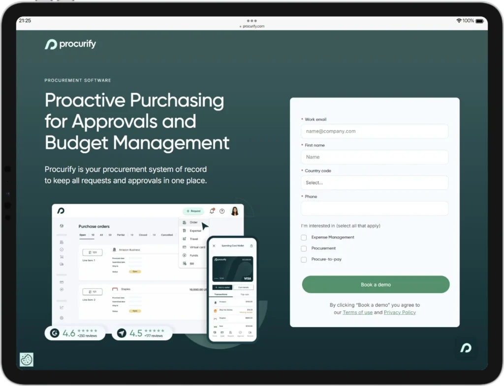
If your landing page isn’t converting, you’re not alone. Many marketers pour time and money into ads only to watch visitors bounce without taking action. It’s frustrating—but it’s also fixable. Whether you’re running paid campaigns, driving organic traffic, or experimenting with retargeting, the landing page is where it all pays off—or doesn’t. In this article, we’ll break down the most common reasons landing pages fail and, more importantly, how to fix them. You’ll leave with actionable strategies, expert insights, and tools that can help you turn things around fast.

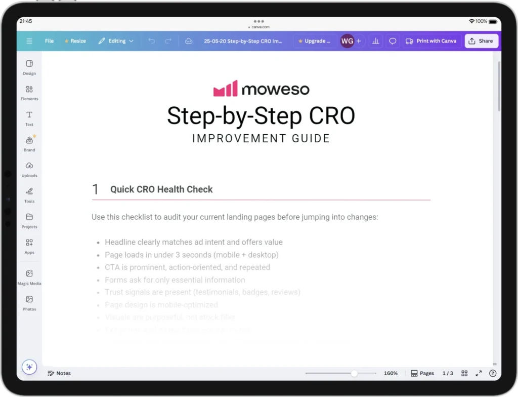
Step-by-Step CRO Improvement Guide
Turn more clicks into customers. This step-by-step CRO guide shows you how to optimize landing pages, lower CPA, and boost conversions with proven strategies, checklists, and test ideas—designed for growth-driven teams.
Common Reasons Your Landing Page Isn’t Converting
Your landing page is supposed to do one thing: convert. But when it doesn’t, it’s often not one big issue—it’s a cluster of small mistakes stacking up. Here’s what to look for first:
Mismatched Messaging Between Ad and Page
When your ad promises one thing and your landing page delivers something else, you’ve lost your visitor’s trust in seconds. For example, if your ad promotes “50% off website audits,” but your landing page talks generally about digital marketing services, users will feel misled. Consistency isn’t just helpful—it’s non-negotiable.
Weak or Unclear CTA
Your call to action should be impossible to miss and compelling enough to click. Generic phrases like “Submit” or “Learn More” don’t communicate value. A strong CTA tells the user exactly what happens next and why they should care. If people don’t know what to do—or why—they won’t do anything.
Slow Page Load Times
Even a one-second delay in load time can drop conversions by 7%. Mobile users, especially, won’t wait. Bloated images, unnecessary scripts, and uncompressed files are common culprits. If your page takes more than 3 seconds to load, you’re already losing conversions.
Lack of Trust Signals
Visitors are naturally skeptical. No testimonials, missing security badges, vague contact info—these all raise red flags. Trust signals like verified reviews, recognizable logos, or a clear privacy policy reassure users that your brand is legitimate and safe.
Overwhelming or Cluttered Design
More content doesn’t equal more conversions. A crowded layout, too many options, or lack of white space can create analysis paralysis. Clear hierarchy, strong visual focus, and room to breathe help guide the user’s attention and make it easier to act.
Sometimes, landing page performance isn’t the only issue—your whole site might suffer from the same disconnect. Read Why Your Website Gets Traffic but No Leads for a broader conversion strategy.
Real-World Case Studies
Seeing the impact of landing page improvements in real numbers can be a game-changer. Here are two real-world examples that show how fixing key issues led to dramatically better results.
Case Study 1: From Bounce to Booked—A Coaching Website
Problem: A business coach was running Facebook ads targeting entrepreneurs but had a 0.9% conversion rate on their landing page. The messaging on the page didn’t match the ad, and there was no CTA above the fold.
Fix:
- Aligned headline and subhead with ad copy.
- Moved a strong, benefit-driven CTA (“Book Your Free Strategy Call”) above the fold.
- Added three short client testimonials and a trust badge from a known coaching association.
Result:
Conversion rate jumped to 4.2% within two weeks, with time on page increasing by 38%.
Case Study 2: SaaS Product—CTA Overhaul
Problem: A B2B SaaS company offered a free trial but used a generic CTA: “Submit.” The landing page also had a dense layout with multiple conflicting CTAs.
Fix:
- Rewrote the CTA to “Start Your Free 14-Day Trial—No Credit Card Needed.”
- Simplified the layout, removed distractions, and used whitespace to create visual focus.
- Added a progress bar to show it was a quick, 2-step sign-up process.
Result:
Free trial signups increased by 64%, and bounce rate dropped by 22%.
Actionable Strategies for Improvement
Once you understand why your landing page isn’t converting, the next step is clear: fix it. Here’s how to address the most common issues with focused, tactical improvements.
Ensure Consistent Messaging and Design
From headline to CTA, your landing page should echo the language, tone, and promise of your ad or campaign. Use the exact offer, similar visuals, and mirrored benefits. Consistency builds trust and reassures the visitor they’re in the right place.
Pro Tip: If you’re running multiple ad variations, consider dynamic landing pages tailored to each message.
Craft a Clear, Benefit-Driven CTA
A strong CTA tells users what happens next and why it matters. Use action verbs, create urgency, and highlight value.
Weak: Submit
Better: Start My Free Trial
Best: Start My Free 14-Day Trial—No Credit Card RequiredPlace your CTA early (above the fold), and repeat it in key sections—always making sure it stands out visually.
Optimize for Speed and Mobile
Use tools like Google PageSpeed Insights or GTmetrix to audit performance. Then:
- Compress images (under 100KB recommended)
- Minify CSS and JavaScript
- Use a fast, reliable hosting provider
And don’t forget mobile. A responsive design with touch-friendly buttons and streamlined layouts is non-negotiable.
If you’re growing fast, your landing page strategy needs to scale too. See our guide to SEO for Scaling Startups to prioritize the right fixes and skip the fluff.
Build Instant Trust
Trust isn’t built with words—it’s built with signals. Add:
- Verified reviews or testimonials
- Partner logos or client badges
- SSL certificates and security icons
- Clear contact info and privacy policies
Use human photos over stock images when possible. Authenticity converts.
Simplify the Layout and Focus
Less is more. Strip out anything that doesn’t support your CTA. Reduce form fields to the essentials. Use whitespace to draw focus. And guide users visually using hierarchy—headline, benefits, CTA.
Bonus: Use heatmaps (like Hotjar or Crazy Egg) to see where users are dropping off or getting distracted.
Want a broader checklist to help prioritize what really matters on a high-performing page? Check out 7 Elements That Make a B2B Website Convert for design and UX tips that drive action.
Tools and Resources
You don’t need to guess your way to a high-converting landing page. These tools can help you diagnose problems, test solutions, and track your improvements.
A/B Testing Tools
Split-testing tools let you test different versions of your landing page—headlines, CTAs, images, even layout—to see what actually drives more conversions.
- Google Optimize (free, but shutting down—use alternatives)
- VWO – Great for visual editors and multivariate testing
- Optimizely – Robust platform for serious testing and personalization
Heatmaps and User Behavior Analytics
Want to see where users click, scroll, and drop off? Heatmap tools visualize user behavior so you can spot distractions and dead zones.
- Hotjar – Session recordings, heatmaps, on-page feedback
- Crazy Egg – Great visuals for scroll depth and click maps
- Microsoft Clarity – Free tool with strong analytics features
Page Speed and Mobile Optimization
If your page loads slowly, users leave. These tools identify performance issues:
- Google PageSpeed Insights – Core web vitals and mobile insights
- GTmetrix – Visual waterfall analysis of load time
- Pingdom Tools – Simple, actionable diagnostics
Landing Page Builders
If your CMS is limiting, these drag-and-drop builders can help you build and test better landing pages faster:
- Unbounce – Great for marketers with built-in A/B testing
- Instapage – Powerful personalization and analytics
- Leadpages – Affordable and conversion-focused
If your CMS is holding you back, switching to a landing page builder might only be part of the answer. Here’s how to decide when to rebuild vs. optimize your website.
Conclusion
A landing page that doesn’t convert isn’t just a performance issue—it’s a missed opportunity. But the good news? Every weak point you identify is fixable. Whether it’s unclear messaging, a vague CTA, or a slow load time, each problem has a solution that can significantly improve your results.
Start with the basics: align your ad and page, clarify your call to action, and simplify your layout. Layer in trust signals, use the right tools to test and measure, and never stop optimizing. The difference between a 1% and 4% conversion rate could be a few focused changes away.
If your landing page (or website) still isn’t converting after multiple tweaks, it might not be broken—it just wasn’t built to support your current goals. Read Your Website Isn’t Broken—It’s Just Not Built for Growth to reframe your next move.

Step-by-Step CRO Improvement Guide
Turn more clicks into customers. This step-by-step CRO guide shows you how to optimize landing pages, lower CPA, and boost conversions with proven strategies, checklists, and test ideas—designed for growth-driven teams.

