In B2B, your website isn’t just a digital brochure—it’s your hardest-working salesperson. Do you suffer from good website traffic, but no leads? If that sounds familiar, you’re not alone—here’s a deeper dive into why your website might be getting traffic but not leads.
What separates a B2B website that fills your pipeline from one that sends visitors bouncing?
This article unpacks exactly what makes a B2B website high-converting. We’ll break down the essential elements that help turn visitors into leads—from layout and messaging to trust signals and CTAs. Whether you’re planning a redesign or just want to plug the leaks in your current site, this guide will help you benchmark your performance and uncover opportunities to improve.
Let’s dive in.
Understanding B2B Website Conversion
Before we can talk about optimizing for conversions, we need to define what a “conversion” actually is in a B2B context.
Unlike ecommerce sites where a conversion typically means a sale, B2B websites are designed to generate leads. That could mean:
Filling out a contact form
Booking a demo
Downloading a whitepaper
Signing up for a webinar
Subscribing to a newsletter
Each of these actions moves a prospect one step closer to becoming a customer.
What’s a good B2B website conversion rate?
Industry averages vary, but most B2B websites see conversion rates between 1% and 3%. High-performing sites can hit 5% or more, depending on the industry and offer.
What impacts conversion rate?
Clarity of message: Can a visitor understand what you do in 5 seconds or less?
User experience: Is your site fast, mobile-friendly, and easy to navigate?
Perceived value: Are you offering something worth exchanging contact info for?
Trust and credibility: Do testimonials, case studies, and third-party proof back you up?
Call-to-action placement: Are CTAs visible, relevant, and well-timed?
Understanding these fundamentals will help you better diagnose what’s working—and what’s not—on your current site.
Key Elements of a High-Converting B2B Website
To turn your website into a conversion engine, you need more than just traffic. You need structure, clarity, and trust. Below are the conversion rate optimization (CRO) components that high-performing B2B websites consistently get right.
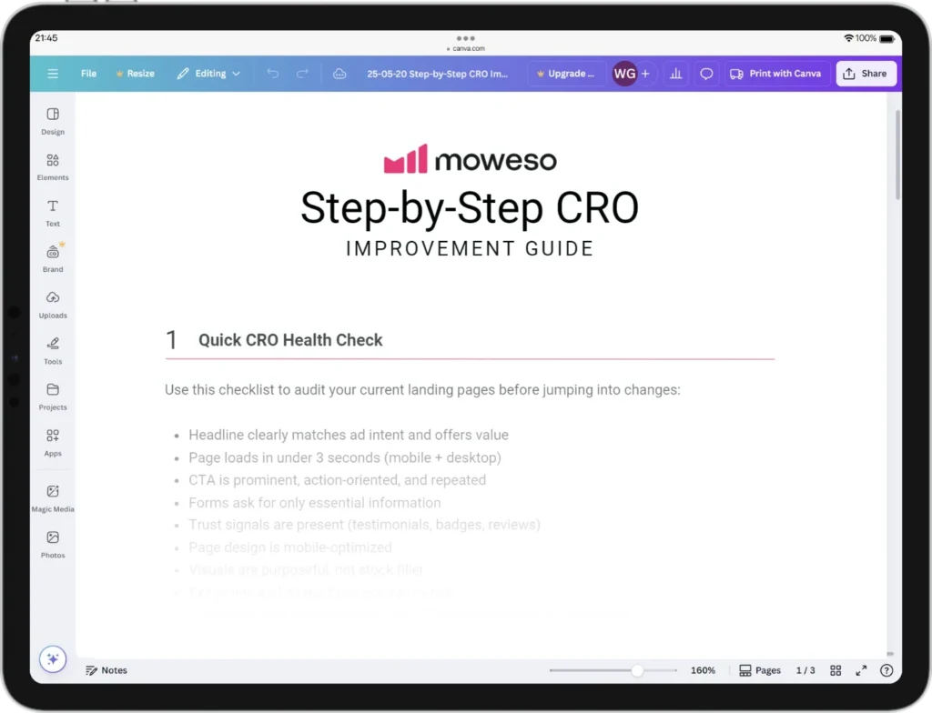
Step-by-Step CRO Improvement Guide
Turn more clicks into customers. This step-by-step CRO guide shows you how to optimize landing pages, lower CPA, and boost conversions with proven strategies, checklists, and test ideas—designed for growth-driven teams.
Clear Value Proposition
The moment a visitor lands on your homepage, they should know:
What you do
Who it’s for
Why it matters
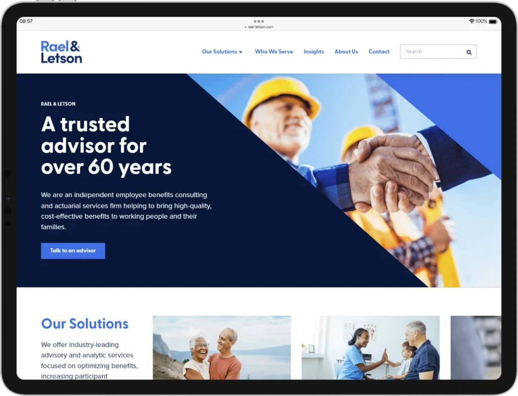
This message should be front and center—usually in your hero section. A strong headline and subheadline should explain your offering without jargon. Avoid cleverness for clarity. Your visitor should be able to say, “I’m in the right place,” within seconds.
User-Centric Design
Design isn’t just aesthetics—it’s functionality. Your layout should guide the visitor toward action.
Prioritize:
Intuitive navigation that mirrors how users explore your services
Fast load times on all devices
Mobile responsiveness (over 50% of B2B buyers research on mobile)
Good design eliminates friction, making it easy for users to find what they need and take the next step.
Trust Signals
Trust is the currency of online conversion. B2B buyers need reassurance before handing over their contact info.
Incorporate:
Testimonials and client logos
Case studies with real outcomes
Certifications, awards, and partnerships
Privacy policies and security assurances, especially near forms
These signals show you’re credible and safe to engage with.
Effective Call-to-Actions (CTAs)
CTAs should be clear, visible, and action-oriented. Avoid vague labels like “Submit.” Instead, use phrases like:
“Get Your Free Audit”
“Schedule a Demo”
“Download the Guide”
Place CTAs strategically—at the top, throughout the page, and at natural stopping points in the content. Don’t rely on just one button.
Want to improve your CTA performance on high-traffic landing pages? Start with why your landing page might not be converting.
Quality Content
Your content should answer real questions and guide visitors through their decision process. That means:
Clear service pages that outline benefits and differentiation
Blog posts that address pain points
Downloadable assets that provide deeper value
FAQs to eliminate objections
Educational content builds trust and keeps prospects engaged longer.
If you’re scaling fast, your content needs to pull double duty—serving both SEO and conversion goals. See SEO strategies built specifically for scaling startups.
Lead Capture Mechanisms
Capture leads without creating resistance. Use:
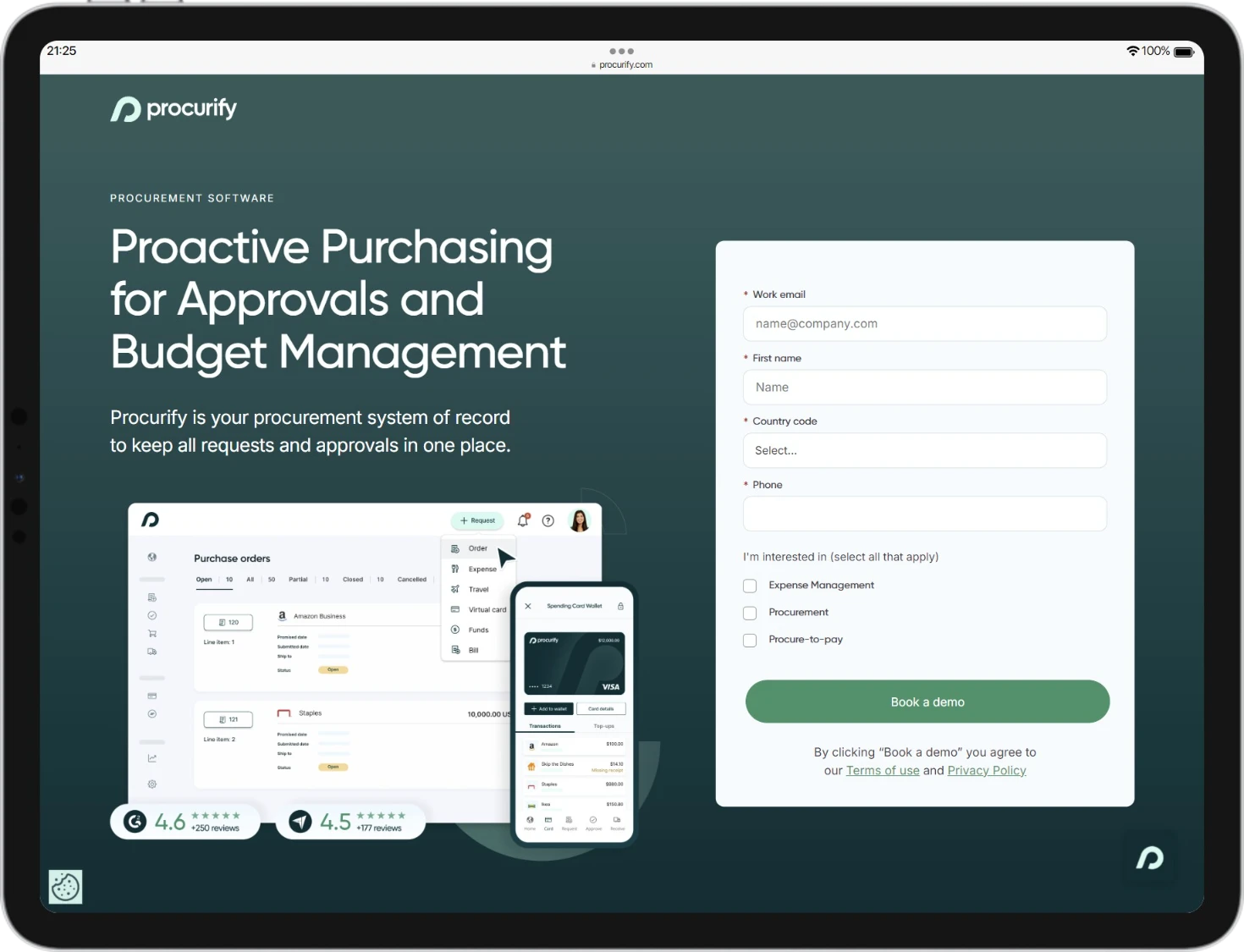
Short, smart forms (ask only what’s necessary)
Chatbots for quick interactions
Gated content for higher-value prospects
Every lead capture element should offer clear value in return.
Analytics and Continuous Improvement
Conversion rate optimization isn’t a one-and-done goal. It’s a continuous process.
Use tools like Google Analytics, Hotjar, or HubSpot to track:
Bounce rates
Time on page
CTA click-through rates
Form abandonment
Then test, refine, and test again. A/B testing different headlines, layouts, or offers can lead to meaningful gains.
Common Pitfalls to Avoid
Even well-intentioned B2B websites can fall short when small missteps stack up. Here are the most common conversion-killers—and how to fix them.
Vague or Weak Messaging
If your headline reads “Innovative Solutions for Modern Business,” you’re in trouble. It’s generic and says nothing specific about what you offer or for whom.
Fix: Be direct. Focus on outcomes, not buzzwords. Use clear language that speaks to your audience’s real problems and goals.
Cluttered Design
Trying to cram too much onto one page confuses visitors. Multiple CTAs, flashy animations, and dense copy can overwhelm instead of engage.
Fix: Embrace whitespace. Guide the eye with a clean visual hierarchy. One page = one primary goal.
No Clear Next Step
You’ve explained your value well—but then what? If your CTAs are missing, buried, or vague, you’re leaving conversions on the table.
Fix: Make your CTA obvious, repeat it in logical places, and be clear about what happens next.
Poor Mobile Experience
If your site breaks on mobile, you’re losing leads. Many B2B buyers begin their journey on a phone—even if they convert on desktop.
Fix: Design mobile-first. Test on different screen sizes and prioritize speed and usability.
Forms That Ask Too Much
Long, intrusive forms can cause friction. Unless you’re offering something extremely valuable, people won’t hand over a dozen data points.
Fix: Only ask for the essentials. If you need more later, gather it over time.
Ignoring Trust Signals
No reviews, no client logos, no evidence you’ve delivered results? Visitors might assume you’re unproven or risky.
Fix: Showcase testimonials, case studies, and recognizable client names. Reinforce credibility at key decision points.
Conclusion
A high-converting B2B website doesn’t happen by accident. It’s the result of clear messaging, smart design, strategic content, and continuous refinement.
Not sure if tweaks are enough—or if your site needs a full overhaul? Here’s how to decide when to optimize vs rebuild your website.

By focusing on what your visitors actually need—clarity, trust, and a reason to act—you set your site up to perform its real job: turning interest into pipeline.
Take a few minutes to audit your current site using the elements we’ve covered. Where are you strong? Where are the gaps? Even small improvements can lead to measurable results.
And if you’re not sure where to start, consider booking a free website audit. We’ll identify missed opportunities and give you a roadmap to convert more of your hard-earned traffic.
